Wallet Design System
Migrated Google Wallet's Figma components from Material 3 to Material 3 Expressive and took documentation coverage from 15% to 100%.








When
2024 – 2026
Platform
Android • Web
Technologies
Figma
At a Glance
The challenge
A new design language
Move Wallet's component library from Material 3 to Material 3 Expressive while 30+ designers used it daily.
My role
UX Designer
Individual contributor on Wallet's Design Systems team, on contract from Oct 2024 to May 2026. Migrated the Figma components and wrote the tool that documents them.
The impact
15% to 100% documented
Guidelines and accessibility specs for 70+ components, generated from Figma. Per-release documentation time halved.
Background
Google Wallet is a digital wallet platform that allows users to store payment cards, loyalty cards, boarding passes, event tickets, and digital keys on their Android devices. The Wallet Design System (WDS) is its component library: 70+ components in Figma, used daily by 30+ designers.
The Challenge
Wallet's library was built on Material 3. Moving to Material 3 Expressive meant rebuilding every component on new tokens, and only 15% of the components had written guidelines.
Built on Material 3
Wallet's design system was based on Google's existing M3 framework.
Rolling out across Google
M3 Expressive expanding to every Google product.
A financial product
Confusion or regressions in a payment flow aren't acceptable.
15% documented
Most components had no written guidelines or accessibility spec.
Material 3 Expressive
Google's design language refreshed across phone, tablet, foldable, and watch.
Color
Expanded dynamic color with more tonal range and emphasis options.
Motion
Expressive motion patterns that communicate hierarchy and state.
Typography
Updated type scale with bolder contrast between display and body.
My Role
I was an individual contributor on Wallet's Design Systems team. I migrated the Figma components to Material 3 Expressive, wrote the tool that generates their guidelines, and produced their accessibility specs in a separate pass. The token system the components sit on was the team's work.
Migration Principles
Preserve trust
Expressive changes should reinforce user confidence in the product.
Token-first migration
Update tokens first (color, type, spacing), then propagate to components.
Parity before expression
Reach functional parity first, then layer in enhancements. Existing flows can't regress.
Document as you go
Capture decisions in real time so the rest of the team can adopt them without re-litigating.
Validate with engineers
Co-validate components against implementation constraints early.
One Component: FOP Row
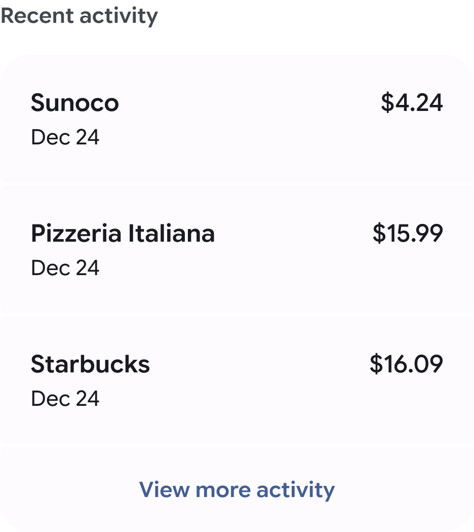
FOP Row lists a form of payment (FOP), such as a card, a transit card, or a bank account.
Accessibility
Each accessibility spec covers contrast, text resizing, touch targets (48 by 48 dp on Android, 44 by 44 pt on iOS), keyboard and screen reader order, roles, and state announcements.
Generated Guidelines
I wrote WDS Doc Writer, a skill for an AI agent that reads a component in Figma and writes its guidelines in a fixed structure. Specs and code were left out because they already existed in Figma. The docs covered what was missing.
Read
The agent reads the component and its variants from the Figma library.
Structure
Overview, use cases, anatomy, variants, containment, selection patterns, loading state, similar components.
Write
One guideline document per component, for designers and product owners.
Accessibility
A separate pass writes the accessibility spec.
Tokens
The components sit on a token system the team built: 404 Figma variables in five collections. Color has two tiers. 177 palette values in four themes feed 112 semantic roles with Light and Dark modes.
Results
100% migrated
All WDS components moved to M3 Expressive.
15% to 100% documented
Guidelines and accessibility specs for 70+ components, counted in the Wallet Figma libraries.
Documentation time halved
Generating guidelines with the skill halved per-release documentation time.
30+ designers
Use the Figma component library daily.
Still Open
The generated guidelines leave out specs and code, which live in Figma. A second pass to bring them into the documentation was planned and not started.
Contact
Building a design system? Let's talk.
Start a conversation