Griffin
Nitro Design System
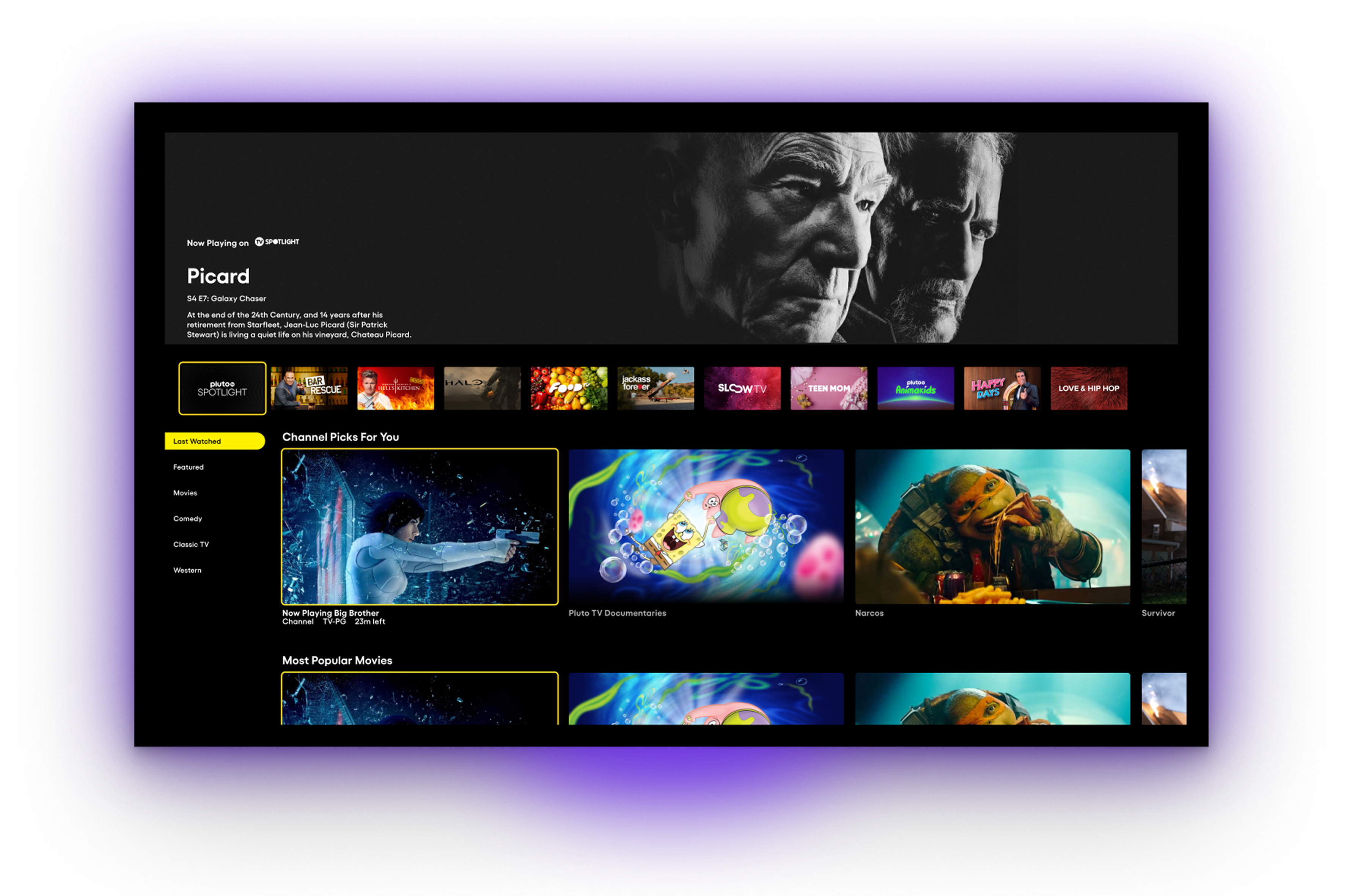
The design system for Pluto TV, a multi-platform streaming application that includes TV, tablet, mobile, and web.
When
- 2023 – 2024
Platform
- Smart TV
- Web
- Touch Devices
Expertise
- Design Systems Design
Tools and Tech
- Figma
- Token Studio
- Supernova
Background
Pluto TV is a free ad-supported streaming television service owned by Paramount Global. Pluto TV offers a wide range of content, including over 250 live channels and thousands of on-demand movies and TV shows, all without any subscription fees.
Pluto TV has applications on iOS, Android, Apple TV, Roku, Amazon Fire, smart TVs, and can be accessed via browser without creating an account.
My Role
As Senior Design Systems Designer, I was responsible of the day-to-day design system work on Nitro Design System. Nitro Design System supports 12 product designers and ~300 platform engineers.
My responsibilities include integrating component contributions, managing design tokens and pipeline, and supporting the designers and engineers in adopting the design system in their work.
Design Tokens
Intro
The newly-formed cross-platform team approached the design systems team to collaborate on integrating a component library into Pluto TV web-based applications (Web/Smart TV). The goal was to unify codebases with a build-once-deploy-everywhere solution (React Native).
We saw this as an opportunity to focus on building out our design token system to not only assist the cross-platform team, but to also support designers and other platform engineers to integrate the design tokens in their respective designs and code.
Structure
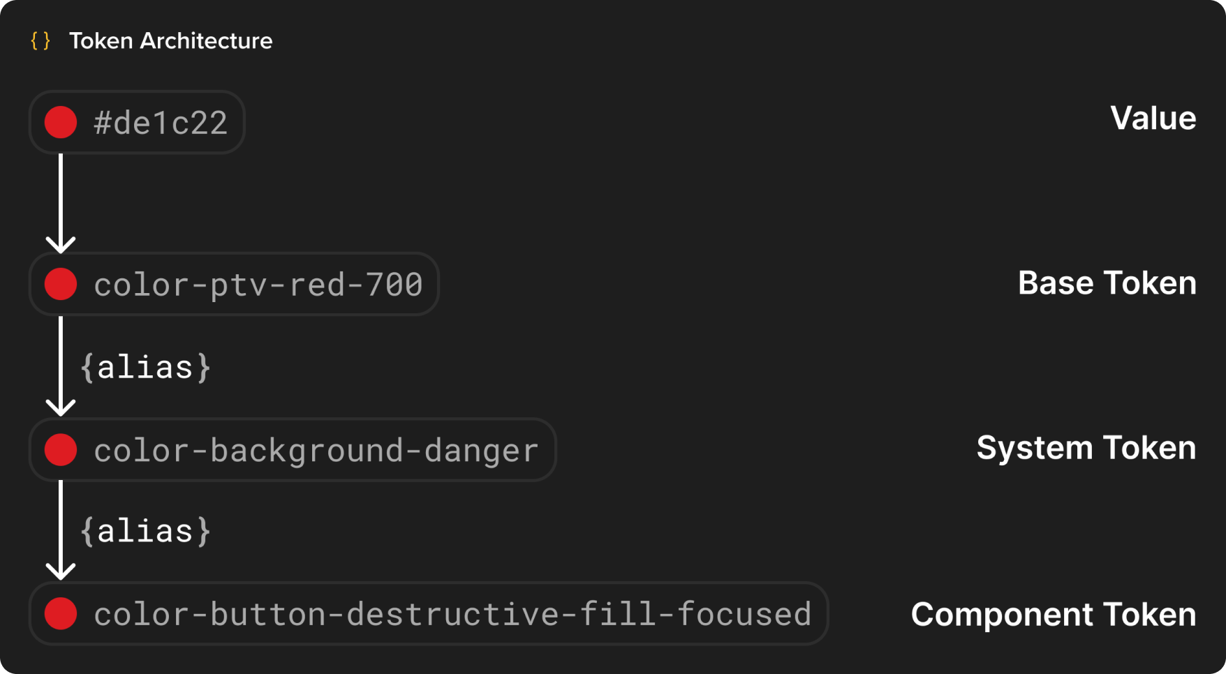
I set up a three-tier token structure with each token tier in its own collection:
- Base tokens are our base values of property definition. These are generic tokens to be aliased into system/component tokens.
- System tokens are semantic tokens that form our visual interpretation of our application.
- Component tokens compose the appearance and behavior of a component.
Types
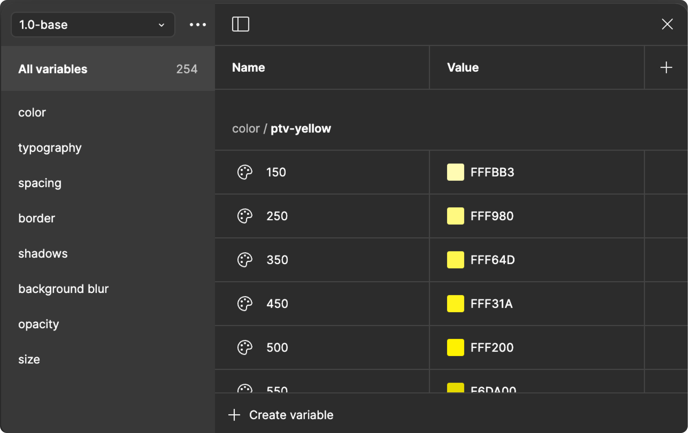
In our initial design token release, I created tokens for these categories:
- Color
- Typography
- Spacing
- Border Width & Radius
- Shadow
- Opacity
- Size
Pipeline
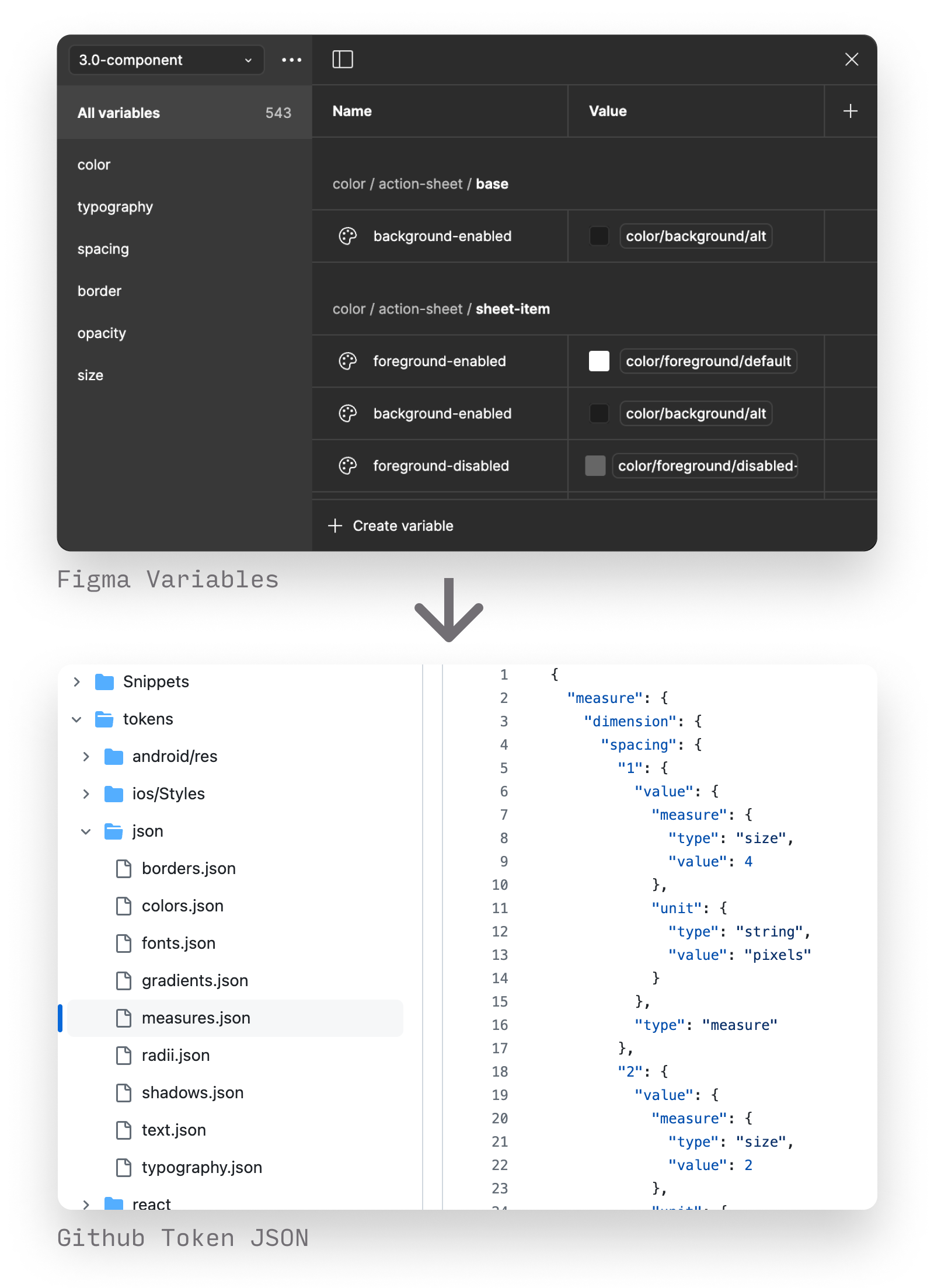
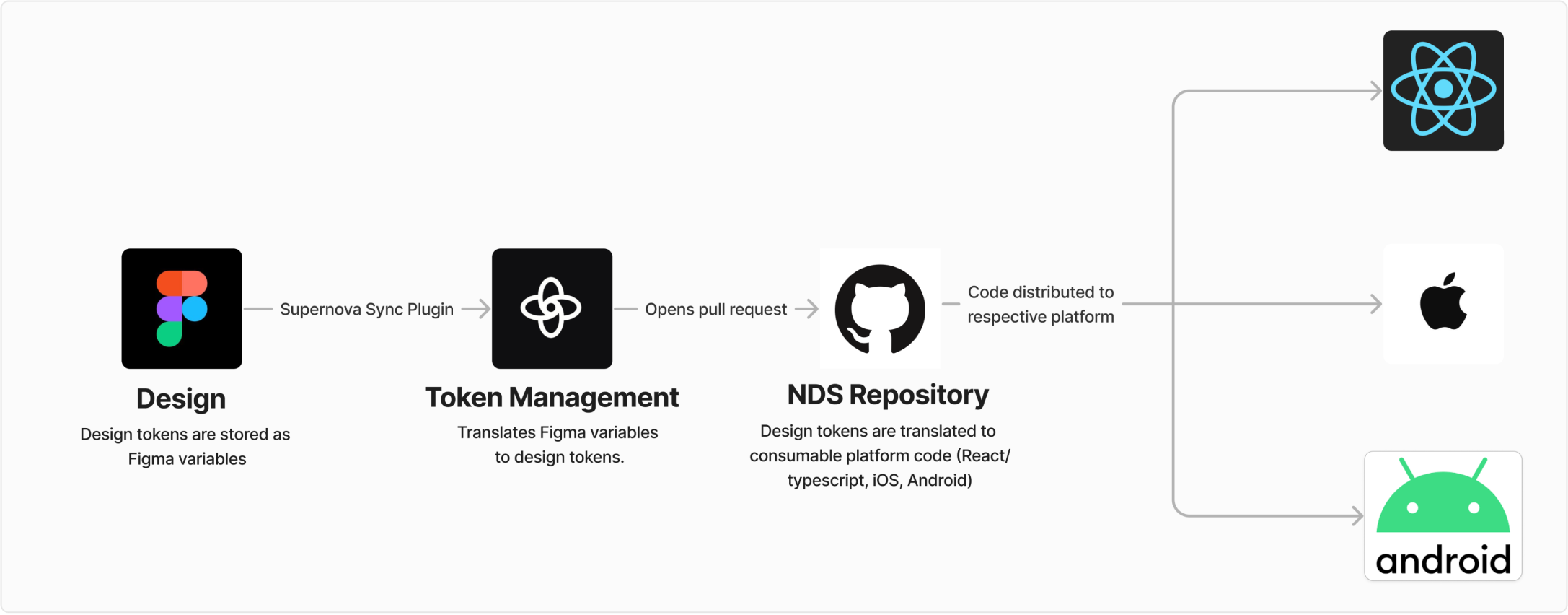
Using Supernova, I created a pipeline from Figma to code.
- The tokens get ingested into Supernova via the Supernova variables plugin.
- Supernova tokens get transformed into code and pushed to our Github repository.
Design Tokens Impact
- After releasing our design tokens, we delivered on creating an easy solution for seamless design system integration into an off-the-shelf component library.
- We've increased designer productivity by providing semantically-named system typography tokens that are easier for designers to choose the correct text style. The previous text styles had an abstract naming convention and left typography choices to designer subjectivity.
- With the announcement of our design token release, other engineering teams became interested in integrating the design tokens into their codebase.
Figma Components
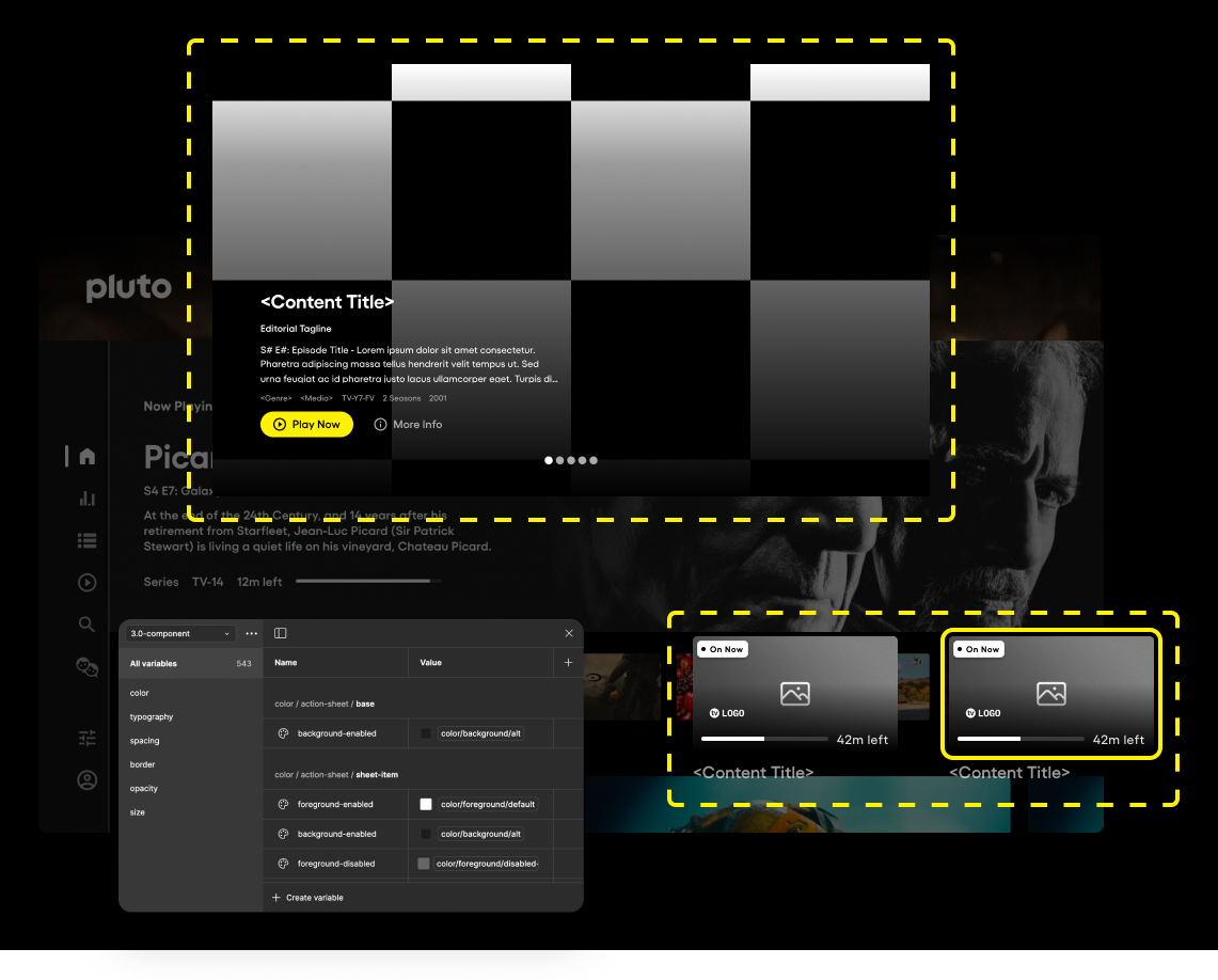
I added a series of component to enable our product design team to be productive.
Pluto TV most integral UI element is the card, the card component features throughout the Pluto TV experience in many forms, sizes, and aspect ratios.
This complex component was the highest in demand from the product design team. We decided to add it to Nitro Design System.
Design process
Our design system team is small, so our design system contribution process is based on designer contributions. Most of the legwork of the visual and behavioral aspects of the component are already sorted out through rounds of product design, design system, and accessibility reviews.
The component design process:
- Audit - Find all instances and screenshot examples of each variation.
- Note - The final documentation is a culmination of your notes throughout the design process.
- Explore designs - Based on the audit and notes, explore and refine component design.
- Document - Make sure the design works within the context of the application.
- Feedback - Get feedback from designers and engineers. Rinse and repeat if needed.
Figma Components Impact
- Designers overall feedback on the card component was positive. According to Figma analytics, it has 952 inserts as of August 2024 (~12 designers).
- All platform engineers now have a consistent design reference, with associated design tokens and documentation to build off, improving productivity and efficiency.