Griffin
Ignite Design System
Reigniting the Ignite Design System — the mortar for First American's suite of Ignite applications.
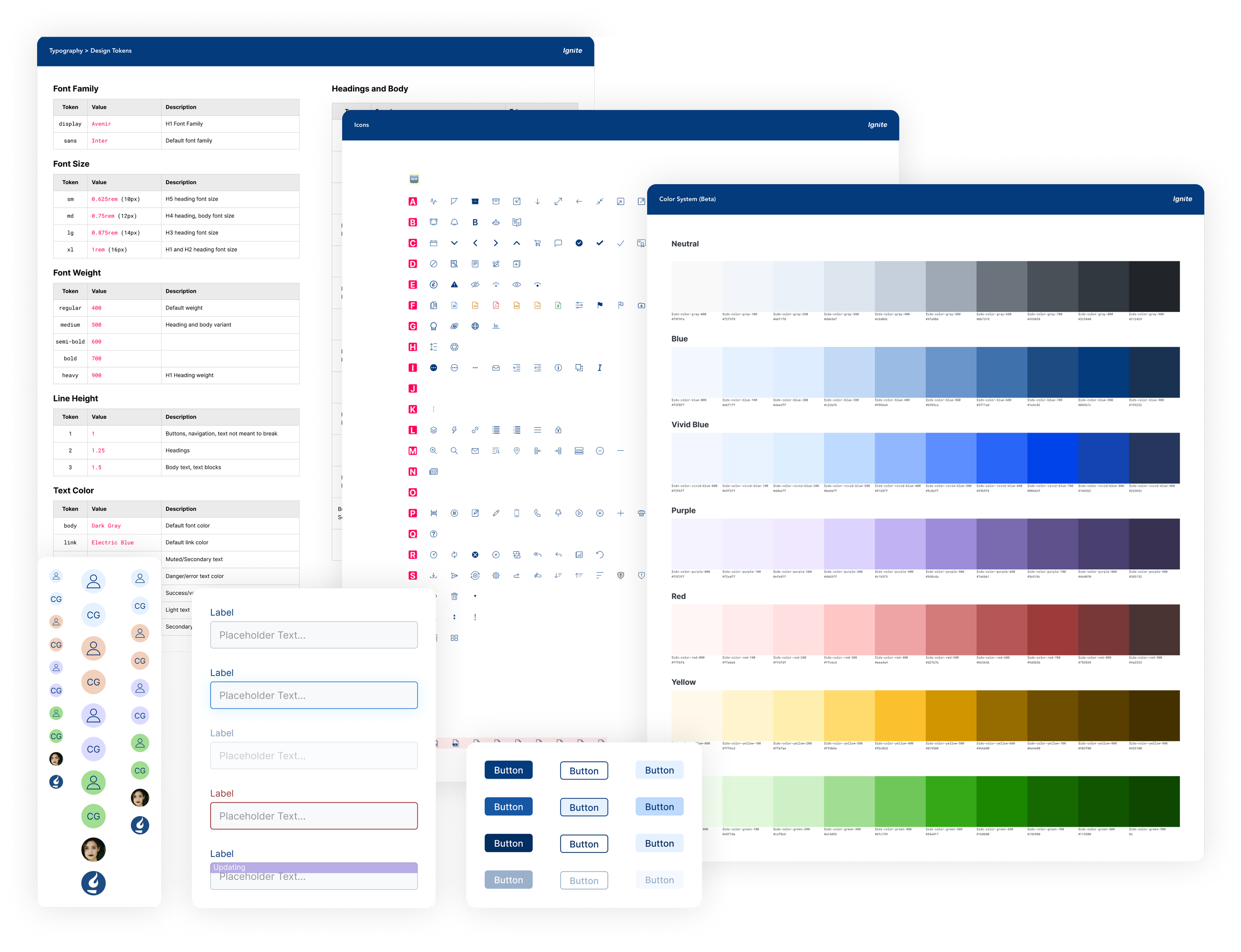
When
- 2021 – 2022
Platform
- Web
Expertise
- Design Systems Design
- UX/UI Design
- Front-End Development
Tools and Tech
- Figma
- Angular
- Storybook
Background
First American is a financial services company that provides title insurance and settlement services to the real estate and mortgage industries.
Ignite is an application that simplifies the mortgage closing process, managing transactions, and escrow.
My Role
As Senior Design Technologist for the Ignite Design System, I was the sole person in charge of the Ignite Design System. I fulfilled several responsibilities as designer, front-end engineer, and de-facto product owner.
Challenges
- The product lacked coherence, as teams operated in silos and implemented their processes and solutions to problems within their narrow context. This approach often led to conflicting work, resulting in duplicate or similar code.
- The component library was underutilized, either because of inadequate documentation or designers and engineers needed to be made aware of the existence of components.
- Product designers were often faced with conflicting or no guidance and were forced to address their design problems ad-hoc.
- Code was frequently copied and pasted from the component library directly into the application or created specific components that lacked reusability.
- The color palette offered plenty of hues but lacked the necessary flexibility of tints and shades to meet the WCAG 2.1 AA accessible contrast ratio of 4.5:1 when pairing contrasting colors.
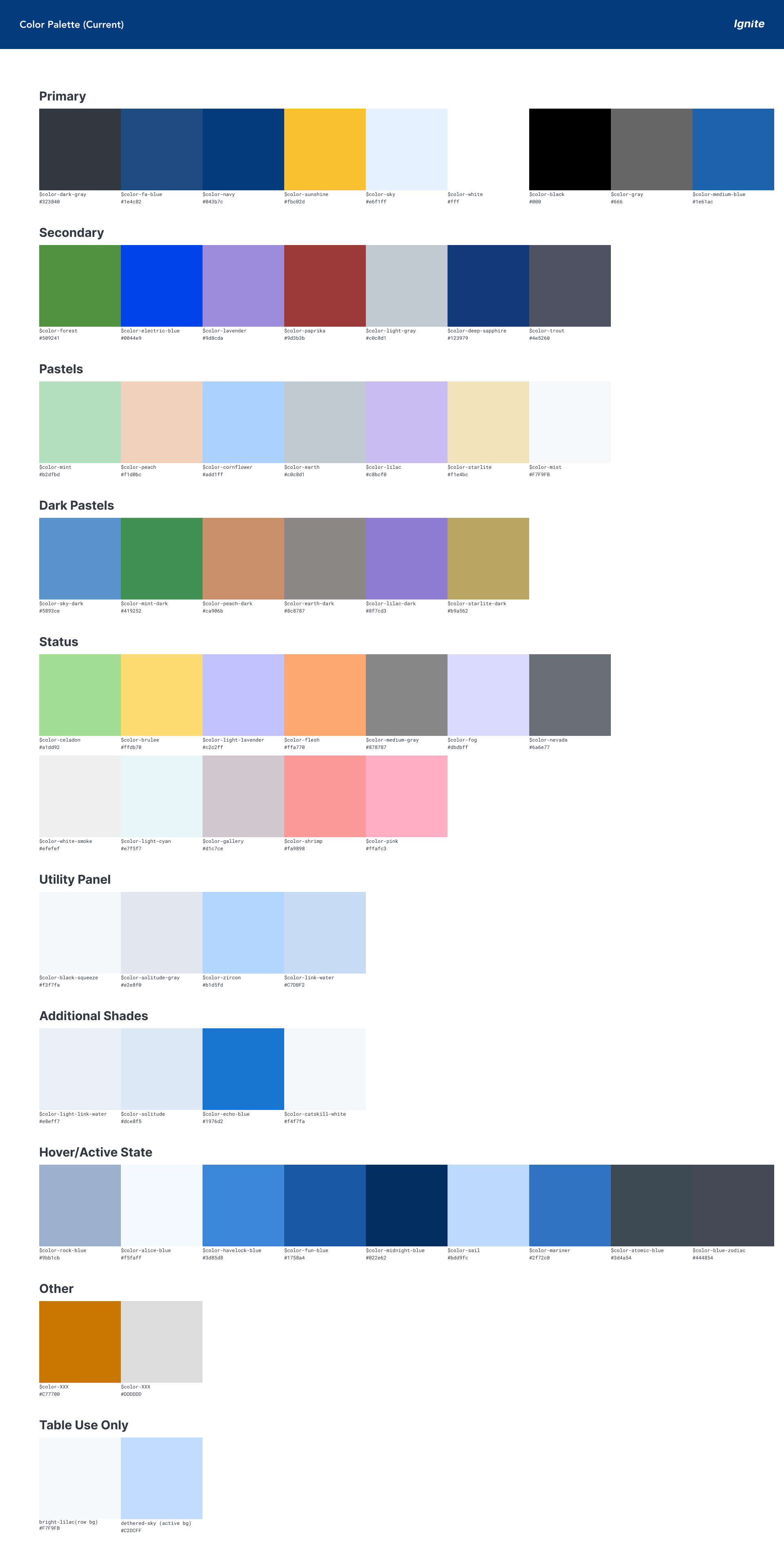
A comprehensive overhaul and foundation were required for almost every aspect of the design system. There needed to be more education, communication, and fundamental comprehension of the purpose of design systems across the teams.
Research
As with any design process, I needed to start with research. There were the makings of a design system already in place, but I needed to better understand goals and team culture to align and prioritize the Ignite Design System with teams who will use it.
Survey
To understand the positioning and standing of the design system within the organization, interviews with colleagues on the product design and engineering teams were needed.
I used Google forms to send out a survey to the design and engineering teams. I tried to keep the questions broad and brief to allow for open-ended answers and respect my colleagues' time.
Questions included:
- What do you think works well in the design system?
- What do you think can be improved in the design system?
- In your opinion, what are three things that we can work on this quarter that would have the greatest impact?
Interviews
To gather more insight on the current state and north star vision of the design system, I interviewed a few key people within the design and engineering team.
My goal was to gather qualitative feedback from consumers of the design system to help prioritize design system initiatives that will make the team more productive when designing and building the Ignite application.
Audit
To discern the full breadth of the product ecosystem, an audit of the Ignite application and the design system was needed.
An audit review consisted of:
- Exploring the Ignite application to document UI patterns.
- Conducting code searches to document CSS properties that could potentially be converted to design tokens.
- Atomic components already existed in some form in the design system, we made decisions about what we would roll back into the design system using our collected data. In this case, the number of times a variant would be utilized.
Culture
One of the most important parts in the discovery phase is understanding how all the teams worked together. A healthy design system culture has complete buy-in from all stakeholders (designers, engineers, product managers, and leadership) with an expectation to support the design system in making designers and engineers more productive. Throughout the discovery process, identifying positives and pain points in the design and engineering cycle is key to getting to a healthy design culture that thrives.
Processes
Through interviews, I also wanted to understand the full design delivery and implementation process to better understand how to seamlessly integrate the design systems processes with how the design and engineering teams design and build out the Ignite application.
Roadmaps
To plan design system initiatives properly, I would need to see how teams are prioritizing their initiatives and align our efforts with theirs.
- I asked each product manager to send me their roadmap to see understand prioritization of Ignite's initiatives
- I asked designers to send me completed design work that was ready for developers but not implemented yet. Design work in this part of the software cycle will provide a window of opportunity to ship something that could be of use to the engineers.
Allies
As the sole design systems person, I don't have the capacity to do everything myself. I need to develop strategic relationships with colleagues within product, design, and engineering that can help with the work, or back me up with an additional voice. These are the allies that will help us move the design system forward.
Insights
Team
Process
Design System
A New Design System-Driven Process
Using the findings from our UI inventory and interviews, we established a formalized process prioritizing open communication and inclusivity. This ensured that all stakeholders and teams were involved and that a design technologist were present in meetings when necessary.
We also wanted to push the design system as a supporting tool rather than dictate design decisions. We included the product design and engineering team in all relevant conversations and decisions to give the design system co-ownership between product design and engineering.
Prioritization started with easy wins — the lack of design tokens and atomic components made for an easy target to get new and revamped tokens and components out for consumption.
Results
Design Tokens and Foundations
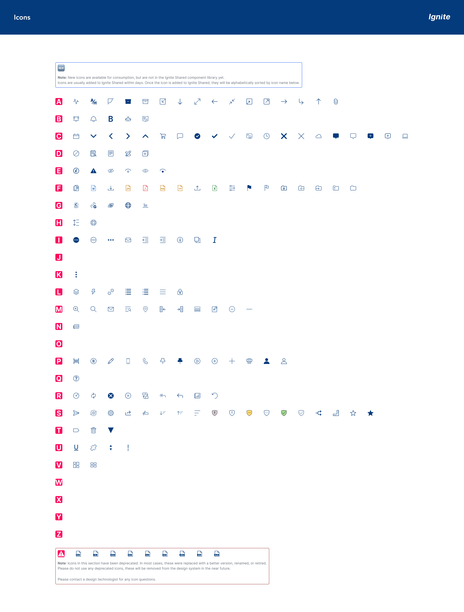
Design tokens and atomic components are fundamental building blocks of a design system. They provide consistency and modularity across designs, components, and layouts as the foundation for almost everything.
The inherited design system had only the most basic design tokens, with limited documentation available. I conducted an inventory to identify the missing design tokens and worked on filling in the documentation for the existing ones.
We refactored and paired down many of these foundational components to reduce complexity. Some atomic components were utilizing styles rather than a component — we converted these to components and communicated this change to the engineering team.
Color System
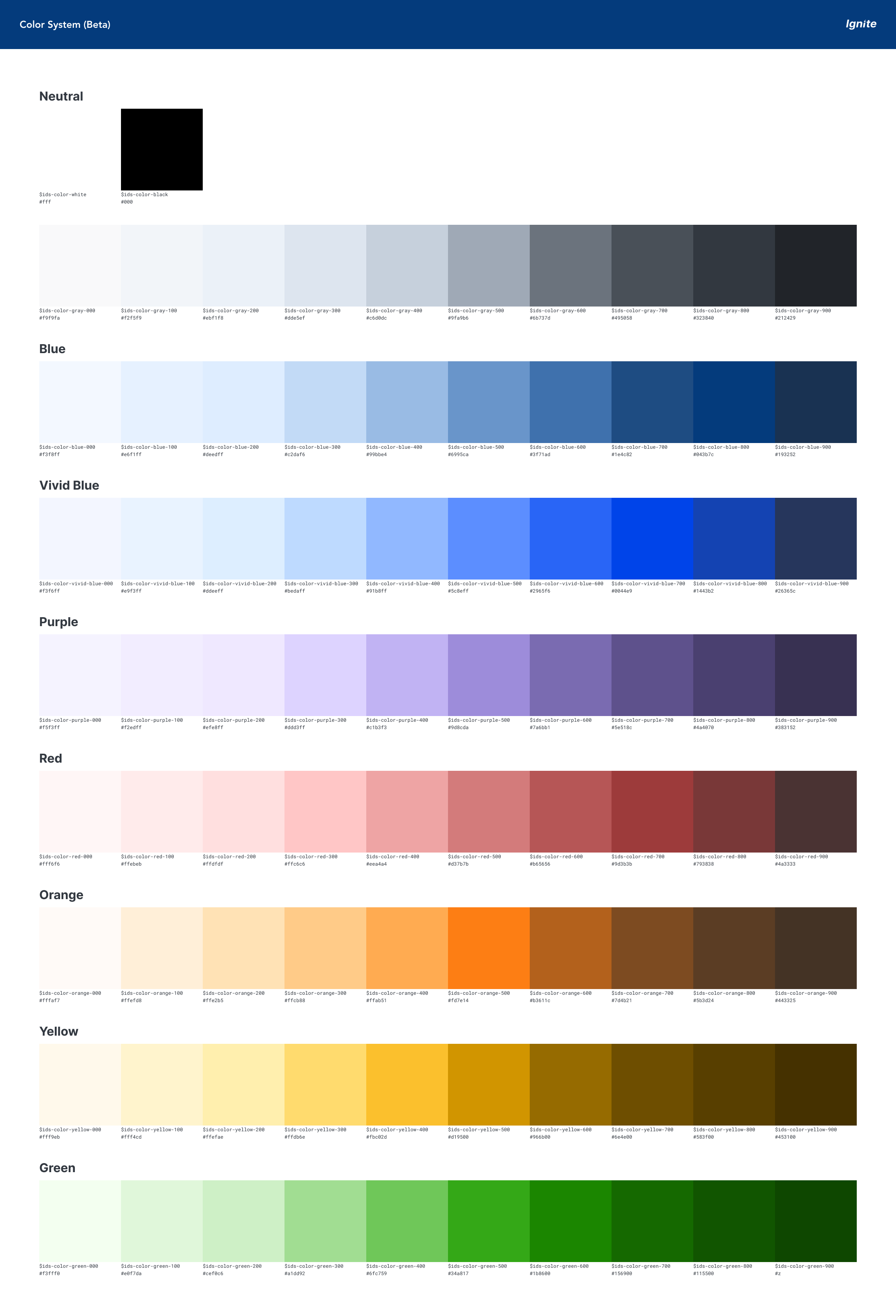
The updated color system involved creating shades (darkening hues with black) and tints (lightening hues with white) for each primary and secondary color. While maintaining the existing color palette, the new system provides greater flexibility and color pairings to pass WCAG 2.1 AA minimum contrast ratios. Additionally, I incorporated aliases, assigning each raw color to a specific semantic meaning, which helped reduce ambiguity about which color to use in various scenarios.
Read more about how I created the color system.
Figma UI Kit
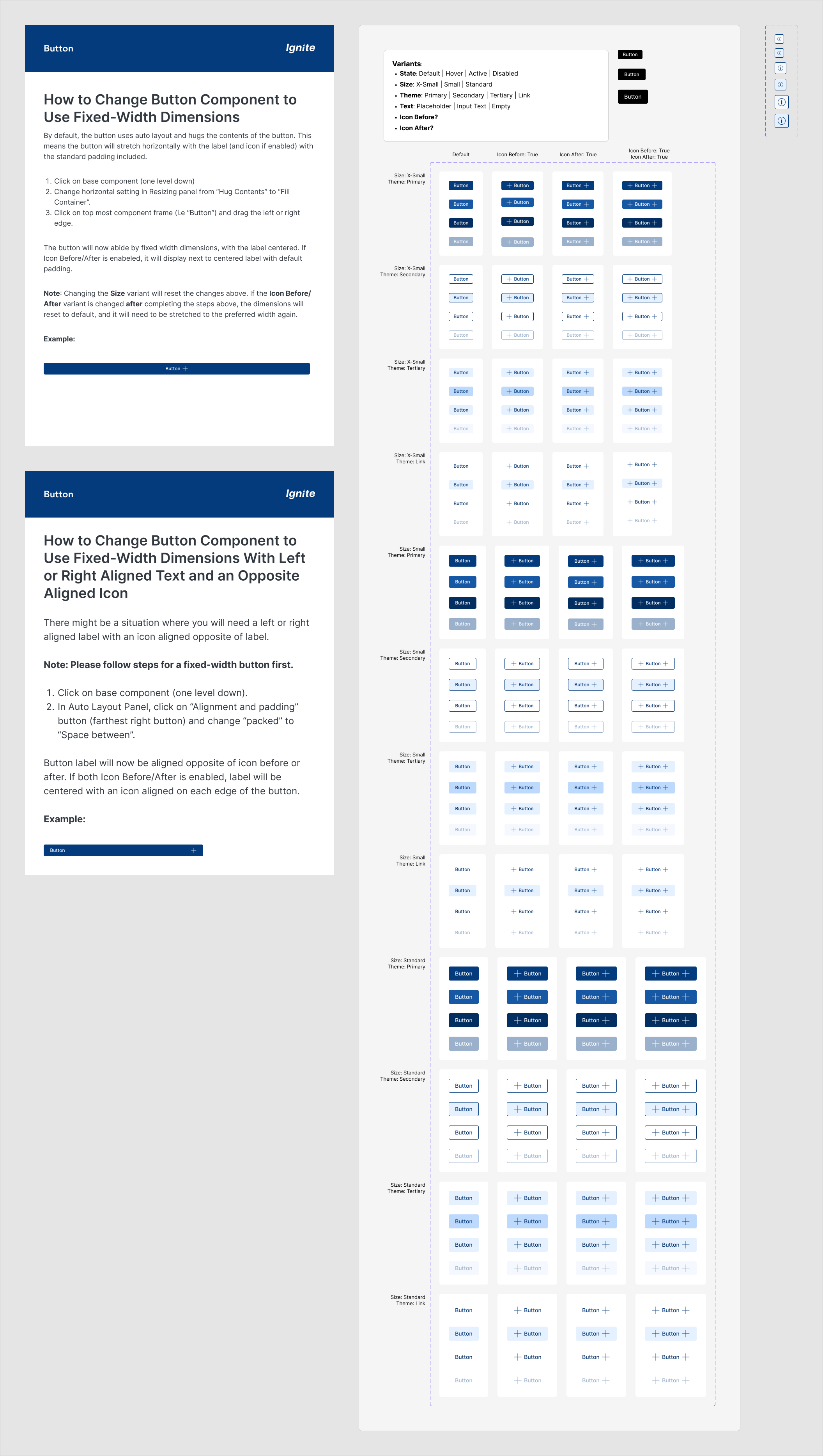
I constructed a brand-new Figma UI kit from the ground up, using Sketch and code components as a reference. The library comprises design tokens (Figma styles), foundational components, and various complex components utilized in Ignite.
Component Library
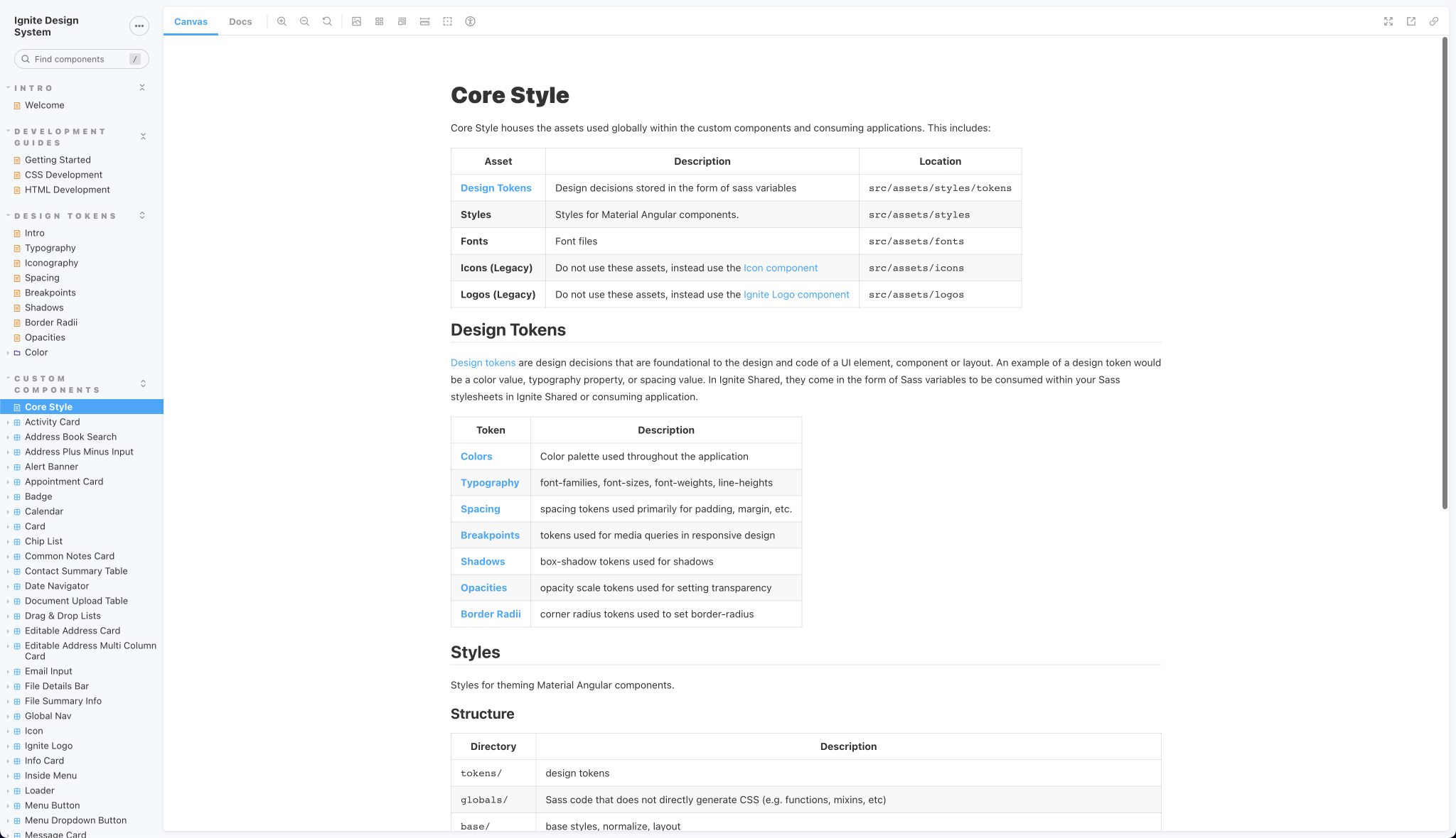
The updates made to the component library encompassed a wide range of additions, such as new design tokens, foundational components, and tooling. The inclusion of new tools helped to simplify or automate various processes and tasks, such Lerna, a tool for managing and publishing packages in a monorepo.
Storybook
The latest major version of Storybook was installed, upgrading to version 6.0, which introduced controls that enabled direct in-browser interaction with components for testing purposes. The enabled Storybook A11y addon performs basic accessibility tests on each component and generates a report.
Future Plans
Ignite Design System is a living product, as with all design systems. Several current and upcoming initiatives on the roadmap will help bring the design system to a satisfactory level of maturity.
Plans include:
- Addressing accessibility issues in design and code.
- Improving design and technical documentation to fill in the gaps.
- Ensuring responsiveness across all devices.
- Adding new in-demand, foundational components, such as text and avatar.
- Implementing linting to catch common coding issues.
- Creating a website to serve as a single source of truth.
- Developing complex patterns and templates for more advanced use cases.
- Enhancing release management with a more robust process and a changelog.