BLVD UI Design System
Building BLVD UI — Boulevard's design system for Boulevard Dashboard.

When
- 2020 — 2021
Platform
- Web
Expertise
- Design Systems Design
- UX/UI Design
- Front-End Development
Tools and Tech
- Figma
- React
- Storybook
Background
Boulevard is a business management platform developed to help streamline the operations of appointment-based businesses, including e-commerce for services and goods, point-of-sale, and scheduling appointments.
My Role
I spearheaded the research, prioritization, design, and implementation of BLVD UI design system. Moreover, I established a comprehensive component-driven design and development process from start to finish to align product, product design, and engineering priorities with design system initiatives.
Challenge
- With no design oversight for years, there needed to be more consistency and coherency in the UI.
- The current design system is Material UI, with little original code and no original documentation.
- Updating the visual language while remaining consistent with the current design language based on Material UI.
- Some Material UI components were adopted into the product, but sometimes the UX did not follow Material UI's design principles and guidelines.
- Creating a design system that can function seamlessly across both new and legacy code and two JavaScript frameworks (React and Angular).
Research and Planning
UI Inventory
I started documenting each color and common UI element by creating a repository of screenshots. After exploring the app from end to end, I categorized each common UI element to see commonalities better.
Research
I needed to understand the process, design, and technical obstacles and create a plan to simplify them. The problems were mainly related to a need for more processes or knowledge. We needed to address the following issues:
- Is there full support from product design, engineering, product management, and executives to undertake the challenge of untangling the current design and creating a design system from scratch?
- How well-versed are the design and engineering team in design systems and systems thinking?
- At what point will design system input be required in the design and development process?
- What are the challenges in integrating the design system with the existing design? How will the new designs blend with the current design?
The product design and engineering team was relatively small, I interviewed a few engineers to get an understanding of their pain points so they could be prioritized and addressed in the early stages.
Insights
Team
Process
Design System
Results
Foundations
To establish the design system, we first focused on setting up the design tokens. As we were still in the transitional phase and lacked components, we provided engineers with the design tokens that could be used in the application to achieve alignment with the design system. The foundation of the design system consisted of various design tokens, including a color system, typography scale, iconography, shadows, opacities, and more.
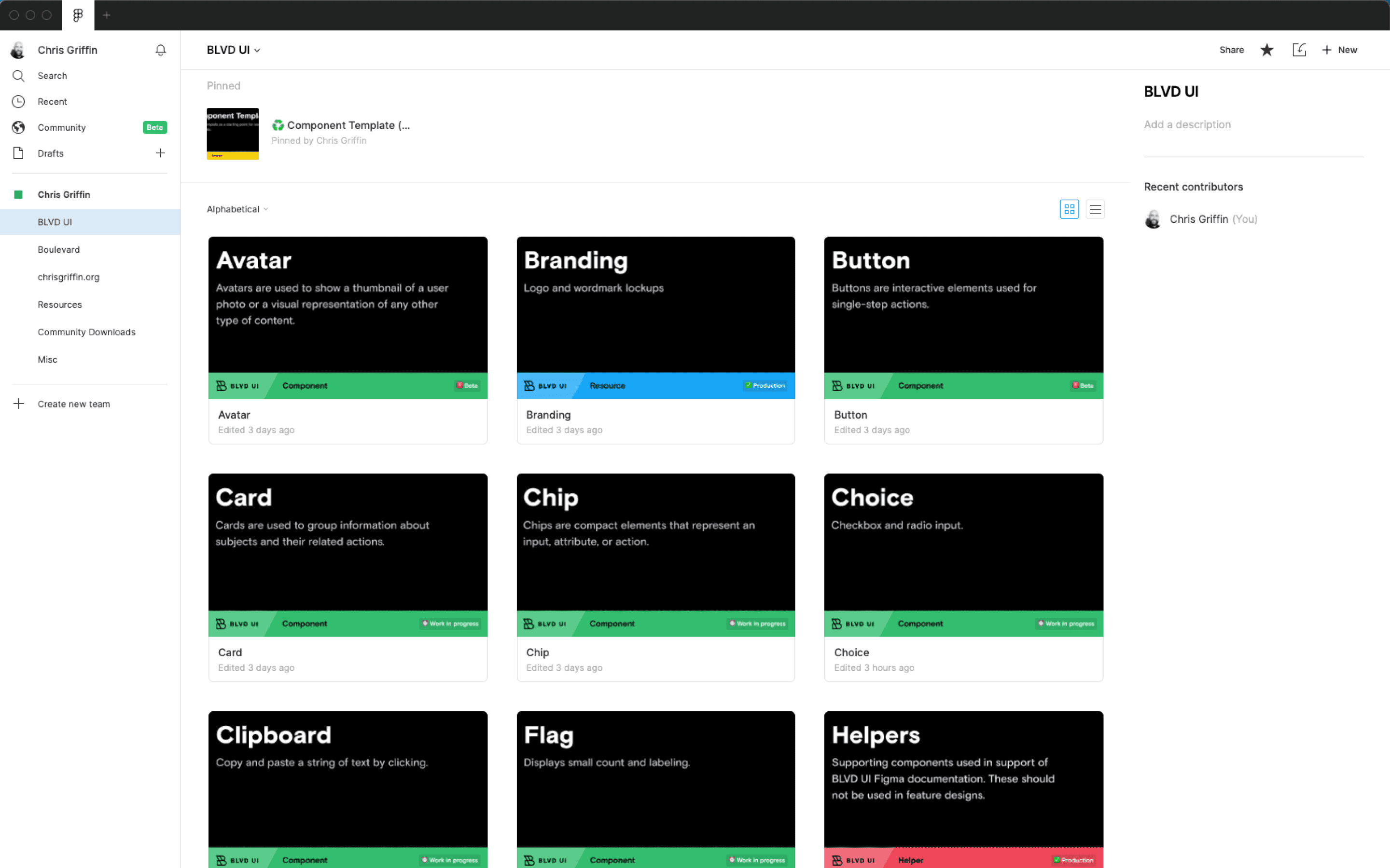
Component UI Kit and React Library
Atomic components like buttons, form elements, icons, and text components followed design tokens. The components utilized design tokens for various design decisions.
To ensure everyone was on the same page and referencing the exact source of truth, each component in Figma had variants primarily consistent with the API of its code component counterpart. I used the same terminology for both Figma and React components where appropriate.
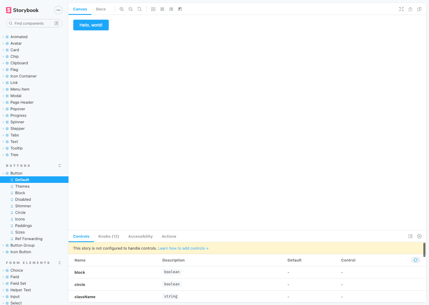
The React component library utilized Storybook to showcase each component and its variations. Storybook is a vital tool in the component development process, as it allows engineers and designers to view production-ready components and test them in a sandbox environment. Storybook was also utilized to test interactions and states through controls and perform basic accessibility testing.
Accessibility
Accessibility is a cornerstone of any design system. WCAG 2.1 compliance was a top priority. To achieve this, we utilized the a11y addon in Storybook that automatically tested each component and provided a report in Storybook.
We also tested our color system and ensured pairings met the WCAG 2.1 AA standard of a 4.5:1 contrast ratio. Additionally, we provided captions or alternate text for all media to ensure content accessibility. Every component allowed keyboard control, enabling users to navigate the application solely with a keyboard.
A New Design Component-Driven Process
As a result of finding a rhythm for the design system build-out and various communication and support channels, we documented a component-driven design and development process that can be repeated.
Included in this process:
- End-to-end design and development process for the design system and consumption.
- Definition of roles between the design systems team and product design and engineering.
- How to contribute and report bugs.
- Communication touch points such as announcements, changes and updates, and support.
- Component templates.
- Documentation templates.
Governance & Support
To ensure the effectiveness of a design system, it must continually evolve and adapt to changing business, design, and technical requirements. However, the team must clearly understand the design system and its proper usage for it to be beneficial.
A design system is a constantly evolving and progressing asset that needs to be understood and utilized by the whole team to provide utility. To support the team working with the design system, I provided:
- Comprehensive guides for onboarding, setup, usage, and the design system's design and development process.
- Detailed design and technical documentation for each design token and component.
- Regular 1:1 design reviews with product designers to ensure their work aligns with the design system and identify potential needs for new components or component updates.
- Weekly office hours are conducted over Zoom to answer questions, receive feedback, and offer assistance.
Final Thoughts
Although I had previous experience with design systems and UI kits, this was my first role dedicated to design systems. I learned a great deal about processes and management, as a design system requires the participation of everyone and their commitment to succeed and evolve. It takes a village to develop and maintain a design system, and all stakeholders must have a basic understanding and support for the system to thrive.
Drop me a line
Please feel free to contact me
if you want to level up your design system, or just to say hello.