How I Built a New Color System
Color systems are an important tool for building accessible web applications, which is why a color system is one of the first items on a list when it is decided to build a design system.
Design systems are usually considered after the application has reached a level of maturity. Before the establishment of a design system, there is a color palette in use already. Depending on what you are working on, there may be flexibility with the color palette, but normally these colors are part of the brand and could be next to impossible to change.
We can work around this.
Here was my process for creating a new color system at First American. There are probably more efficient ways to do it, but I had limited time and resources to push this pet project forward.
But first…
What is a color system?
A color system is more than just a color palette, it is a set of colors that represent the brand and provide meaning within an application. Color systems also provide context and guidelines on how to apply color to the application, and color pairings that meet accessibility requirements. Secondary to accessibility, a color system should be flexible enough to provide enough useable options for the designer to utilize in their design work, while also assigning applicable meanings to the color for certain states or actions (e.g., disabled state, success and error actions).
Why are color systems important?
When the color palette does not offer enough options, designers are left to their own devices to fill the gap, they end up using a self-serving color value that works for them. Add many designers to the mix, and this can snowball into an out-of-control, undocumented, color palette that can not only create havoc for designers but for the maintainability and consistency of the application.
The Problem

Unbalanced color palette
At First American, our color palette was comprised of an abundance of light grays and blues, but only one color value for green and red. In an application that is 90% blue and 10% gray, this makes some sense, but the original color palette did not support tints (lighter) or shades (darker) versions of each primary and secondary color. Colors seemed to be handpicked subjectively and introduced in an ad-hoc manner when a designer had a use case for a new color, typically at the sole discretion of that individual designer. There was a lack of process around color system management.
Abstract color names
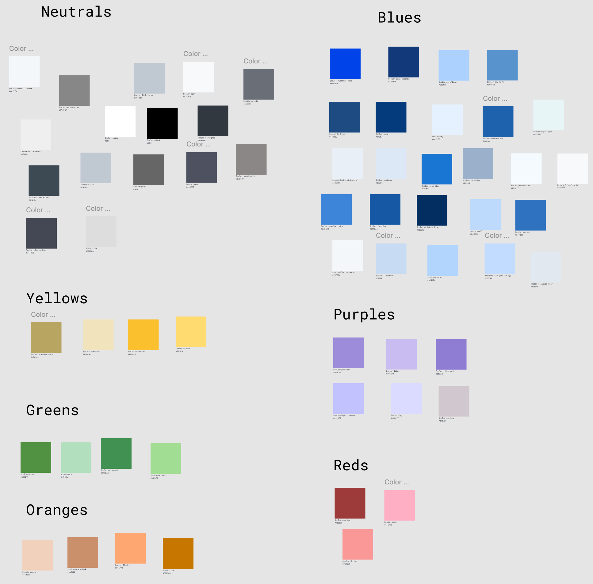
The color naming scheme for the old color palette used real-world physical examples of the color, such as celadon, gallery, flesh, and mist. When you think of the word gallery, what color are you thinking of? What is celadon? I actually had to google that one.
This naming convention was not predictable, very confusing, and not scalable.
Inconsistent color application in the code
First American has one monorepo containing all the Angular components, consumed by 20+ micro front-end applications. There was no consistency in how color was applied to each application, some applications consumed the design tokens (Sass color variables) from the component library, some applications used their copied and pasted version of the color palette within their application, some applications had straight-up HEX values directly in the code.
Research
To build a color system, we'll need to do a little research first. We should start with these questions:
- Is the color palette documented?
- What is the origin story of the color palette?
- Which colors are part of the brand and can not be removed and altered under any circumstances?
- Which colors were chosen in a systematic/logical way, and which colors were added ad-hoc for a specific use case?
- What are the primary, secondary, and status colors in your application?
- Can the primary, secondary, and status colors be changed or altered in any way?
Audit
Conduct a color audit (similar to how you would conduct a UI Inventory). Create a spreadsheet to document each color in your design library and application. Start with the design documentation first, these colors are usually chosen with purpose.

Under less of a time crunch, a script could have been written to gather this data, but this was a manual task for me. I open up VS Code and do a global search on the code, but your mileage will vary depending on the code architecture. If the code is organized in an efficient way, then the colors should be easy to find. Bad code architectures that might involve more than one repository will make the search a bit more complex. Each color should be documented in a spreadsheet (or a tool you are comfortable with). Record how many times the color is referenced in the code. I also like to output the actual color in the spreadsheet so there is a visual.
Once the color audit is complete, it's time to comb through the colors and get an understanding of usage. Depending on the age and quality of the code, you can start to see the bad patterns. Bad code architectures will typically have more bespoke color values.
First, I color code spreadsheet rows:
- Highlight aforementioned untouchable colors (i.e. brand) in green.
- Highlight colors that are obvious technical debt (e.g., colors that are documented and has a token, but has a hardcoded hex value in the code) in red.
- Highlight colors with these traits in orange:
- Colors used once or never (only documented as a token or variable but not used)
- Colors that are nearly identical to another color in your palette. It may require some research to figure out which of the nearly identical colors to drop.
After paring the colors down, it's time to categorize.
Categorization

Bring the green and orange highlighted colors into Figma (or your favorite design or diagram tool) as frames that can be freely dragged around on a screen. Categorize colors by hue (for example, gray, blue, green, red, etc.), this will make it easier to create order in the color chaos. Any highlighted color groups that are nearly identical can be pared down to one color based on usage — so if Color X is being used more than Color Y, we can drop Color Y and use Color X instead.
With your colors categorized, there is now a foundation to create a new color system. We have a visual document to identify which hues to use and how many shades and tints I will need for each hue to have color coverage for our application.
The New Color System
Colorbox
I used a tool called Colorbox to create a new color system by applying an algorithm to key colors. Colorbox generates a color band using an algorithm based on color and graph inputs. You can learn more about Colorbox and the more technical aspects here and here.
To provide the most usable colors, here are some tips:
- Do not use the same algorithm for all colors, the same algorithm inputs that work well for one color may not have the same results for another color.
- Skew each side of the color band towards light and dark respectively, mid-range colors are of little to no use due to accessibility contrast standards.
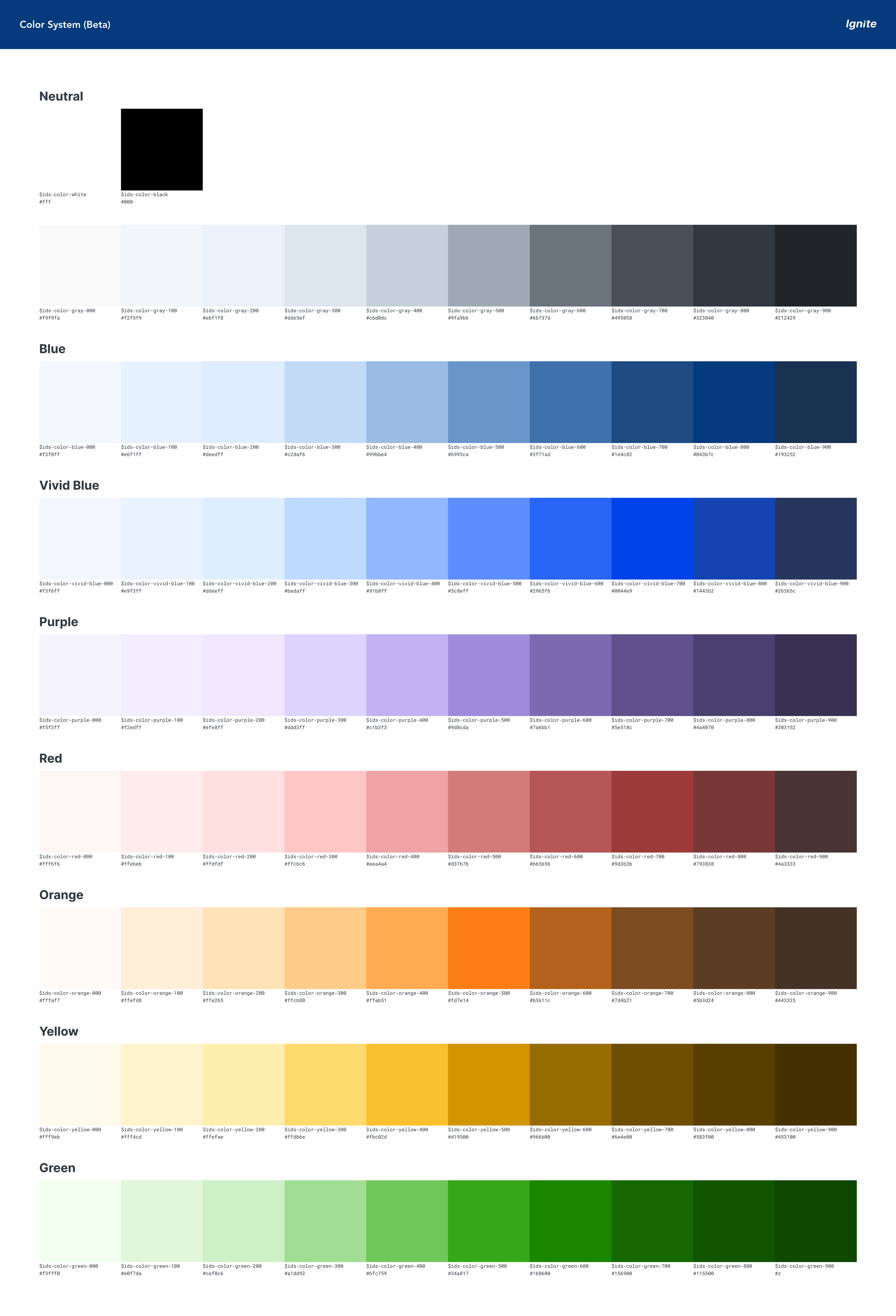
- Each color stop in each color band should be similar in tint or shade. E.g., blue-100 and green-100 should be of similar tint; this will make the color system more predictable when codifying color pairings for accessibility contrast standards.
Define The New Color Bands

Using the primary and secondary colors (this includes gray, blue, vivid blue, purple, yellow, orange, red, and green). I tweaked the algorithm several times for each key color to create ten variations. I also wanted to add flexibility in the new color system to map to the old colors without glaring changes to the color balance in the UI.
I took the base colors and assigned them to a semantic name in the form of a variable, so designers and engineers would have a better understand on color usage removing the subjectivity and cognitive load (BYE Celedon and Gallery!).
Next, I tested the new colors in Figma mockups to see if they passed the eye test. Here I'm checking for visual regressions to confirm the new color system works as intended. Then I created a migration document for migration from the old color palette to the new color system. This document each colors semantic usage (e.g., black-800 = default body text).
Although I had started introducing rudimentary design tokens (Sass variables) in the component library, they were not being consumed in the applications just yet. The code was directly referencing reference tokens (i.e. color names) with no multi-tiered design token structure.
We rolled out the color changes in phases:
- Introduced the new color system in the Figma library as beta
- Pulled the new colors on all new components
- Mapped the new colors to new design tokens
- Communicated a deprecation window for the old color palette in the component library.
Takeaways
- Even without a robust comprehensive design token package, the new color system decreased designer and engineering confusion in the design and implementation stage. All colors were documented, along with their semantic usage.
- The new color system added additional color options, which lead to less color improvisation by the designers, decreasing technical debt in the code.
- The new color system laid the foundation to build a more comprehensive token package with system/semantic and component tokens.
- With the new color system, we were able to create monochromatic color pairings that meet WCAG 2.1 AA contrast ratio threshold. Because the color system has consistency across color bands, you could designate a global color stop for the background and foreground colors.
E.g., a card background could be blue-100 and the foreground could be blue-800
This would also work consistently for green, red, etc.
Resources
- https://design.lyft.com/re-approaching-color-9e604ba22c88
- https://kvyn.medium.com/introducing-the-new-colorbox-e0109c021729